The reality of consumer products
I’ve never met an entrepreneur who’s happy with their metrics.
Whether you’re talking about sign up rates, retention rates, or how often your users create content – on face value, the metrics always seem terrible. The secret is, almost everyone’s consumer product metrics are horrible, so once you start to compare them with everyone else’s terrible metrics – then at least we’re all in the same leaky boat together!
Other than the exceptional cases, consumers are impatient and disinterested in your product. Even the ones who sign up to try it out, only a small % are willing to stick around to use it more. As we’re discuss later, a typical product might see 90% refuse to sign up to a product. And then of the ones who do sign up, over 90% of users disengage and become inactive over time. These metrics are terrible, but they’re normal.
The purpose of this discussion isn’t to excuse mediocre engagement or retention, but rather, to have an honest discussion of what most companies are seeing in the market. This will help us plan better, give us more options for our Plan B, versus being total newbs on the issue.
This essay breaks down a few different metrics and the uphill slog we all face as consumer-focused entrepreneurs:
- Signup rates
And before we start, it’s worth mentioning that every product is different. Mobile apps often have better engagement metrics, but have lower upfront conversion rates. SEO products have the lowest signup rates. But the intention of this essay is to add to the discussion for the kinds of social apps being built right now – social consumer products on web and mobile – and give everyone a baseline for discussion.
Signup rates as low as 1%
Average signup rates are surprisingly low. On homepages, it’s not so bad- sometimes 10 or 20% signup rates are possible. But they can be as low as 1%, or even lower, when you’re talking about non-homepage pages where people are coming in from SEO. In the extreme, when a user arrives on a content-filled landing page after typing in a query like “what is this growth I have on my back?†their primary interest is the content, not the product you’ve created. Similarly, there’s always pressure from Google’s robots to present as much content as possible, rather than hiding it behind a registration wall.
Thats why for SEO-driven products like Stackexchange, Yelp, and others, the conversion to a signed up user is extraordinary low on these content pages, sometimes much less than 1%. This leads to a pretty depressing metric in an era where most social products measure and report their Monthly Active Users, which consist of activity from users who have signed up. Unique users per month seems so 1998 :(
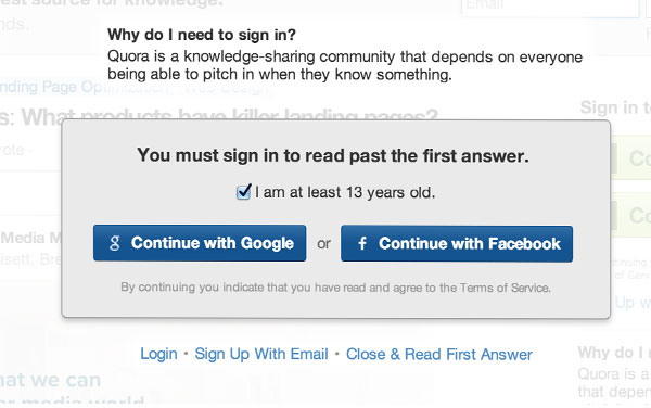
What if you want to raise the signup rates on these detail pages? Of course you can choose to raise this number by gating the content, as Quora has does, but perhaps at the expense of UX:

But these are just the content pages. If we’re talking about the homepage, we’d expect signup rates to be much higher. The reason is that this traffic is usually based on word of mouth, which leads to sign up rates that are 10% or higher, since people are looking for your product in order to try it. Even better, you can send them to a minimal homepage that generates signup rates closer to 20% or 30%.
Over 95% of your users are inactive on any given day
Another metric that’s easily depressing is retention, where it’s common to see that the vast majority of your users, often over 90%, aren’t engaged on a daily basis. Instead, they’ve churned or are only active a few days per month.
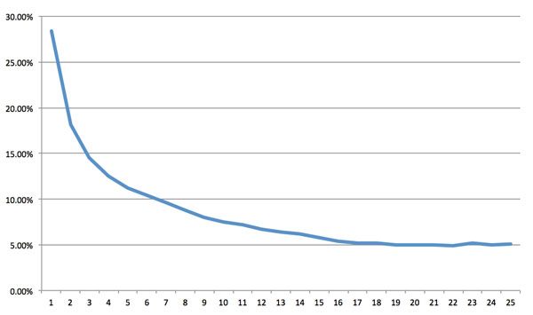
The reasoning for this is simple. It’s become common to look at retention/frequency metrics in the form of D1 versus D7 versus D30 retention. Naturally, D1 means, “the number of users active on the day after signing up.†And usually retention curves look something like the below, where there’s fall-off pretty quickly with eventually stabilization around a mediocre number – often a single digit percentage:

Usually there’s a very steep drop-off over the first week or two, and then it starts to stabilize. But you lose a ton of active users in the meantime, which is a result from multiple factors. This curve combines a few different aspects of your product:
- First, how many users sign up and actually try out your product (onboarding)
Given that frequency is often low – 3 or 4 active days per month isn’t uncommon – when you pair that with crappy onboarding or retention, then very quickly you’ll see that getting 10% of your users to come back every day is an amazing feat. Anything more than 10% of your total users coming back every day is a success case! More often it’s 5%, or even lower.
So what if your metrics aren’t at this level? Sadly, this isn’t something that’s easily fixable with something superficial, like more email or push notifications. As I’ve noted before, a lot of these engagement metrics are more nature than nuture, and getting high usage every day has as much to do with the product category you’re building for as anything else. I’ve yet to see a product with horrible DAU/MAU get fixed using cosmetic changes. If your engagement or frequency sucks, figure out how to tie it into someone’s pre-existing behaviors, rather than asking them to do something new.
Changing engagement metrics might be the hardest thing to do with products, though. You can make your onboarding better, or get people to invite incrementally more friends. But getting them to come back over time, that’s not something that’s easy to solve using optimization techniques.
50% of your users are forever alone
So let’s say you build a new social product, whether it’s a new form of microblogging or a new messaging app. Of course, the ideal is to have a nice feed full of personalized content. But it turns out, most products are very, very far away from that. How many people have, effectively, zero friends? You’d be surprised to know that often 50% or more of your users don’t know anyone else in the service, meaning that you need to backfill their feed with a bunch of content just from one person, or worse yet, impersonal content.
In fact, one of the most explosively viral products in recently history had a full 65% of their users disconnected from anyone else:
Instagram.
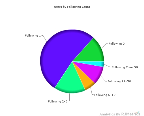
Here’s a pie-chart by RJMetrics of how many Instagram users followed, while the product was in their first year:

And later in the article, this is what they say about it:
Interestingly, over half of Instagram’s users are following exactly one other user, with another 13% not following anyone. We checked into that, and it looks like the vast majority of users who follow only one other user are following the “Instagram Team†account, which was likely automatically added to their list at signup.
This means that 65% of users effectively follow no one.
(Emphasis added.) This is amazing, and ultimately didn’t stop them from becoming a very functional social network alternative to Facebook itself.
When you combine the fact that getting social graphs to fill is very hard, and the fact that only a few percentages of users will author content (known by the 1% rule), then you can imagine why creating a healthy, dynamic news feed is so hard.
Ultimately, density can be solved by more growth. More users mean a denser social graph. But also, a key component of getting people to follow more people is to connect their Facebook accounts, their email addressbooks, and other pre-existing graphs which help them bootstrap their relationships. Or do what Twitter does, in forcing users to follow before creating an account.
Mediocre metrics aren’t an excuse
The point of this essay isn’t to provide an excuse for mediocre metrics, but rather, to point out the harsh reality of the situation. There’s just a stark contrast between how much we as consumer entrepreneurs care about our products, versus our target audience who really doesn’t give a shit about how much effort we put in. As a result, people aren’t signing up, and if they do, they don’t use the product nor have a good experience. It’s very hard.
But even as the average product’s metrics suck, as an industry we’re looking for the unicorns. So just as I say that a 30% DAU/MAU is good, when you compare that to Whatsapp’s 70%, you can see the gulf between good versus great. We all want great, because the tech industry is all about building great products.
On the plus side, even though these percentages all seem small, great businesses have been built from a few percentage points here or there. How many paid subscription services monetize by convincing 2-3% of users to pay? Tons of them. Or who build billion dollar ad-supported businesses just based on getting a few % of users to click on ads? That’s everyone in the ads business. So it can work, but until it’s scaled and is growing faster, these metrics can look like a mess. Until then, keep at it.
(Andrew Chen is an entrepreneur and blogger based in Palo Alto, CA. He blogs here.)
To become a guest contributor with VCCircle, write to shrija@vccircle.com.